HOVER
Connect
Overview
The HOVER app gives users measurements and a 3D model of their home by taking eight photos around their home. Connect is a feature that allows existing users to send an invitation to current/new users to capture the photos for them.
My Role
Product Designer
Duration
Aug 2020 - July 2021

Problems
Users weren’t utilizing the Connect feature and we weren’t sure why.
The Support team were receiving phone calls everyday wondering where they were in the process of Connect.
Most users were not told beforehand of the HOVER app, so when they received the SMS/email they were hesitant to trust it.
When users click on the email invitation on their phone, it would keep them on the web and not direct them to the app.
Too easy to “disconnect”
The link in the SMS/email is the main source in keeping the Connect intact, so when a user captures photos of their home without clicking on the link, it disconnects them from the job.
If users sign up with a different email than the one that was sent to them, it leads to disconnects.
Solutions
New messaging in SMS/email sent to users
New Connect landing screen informing users
Mobile to web reroute
Banner Connect shortcut (sender experience)
Goals
Understand how users are/are not using Connect
Increase Connect usage by 15%

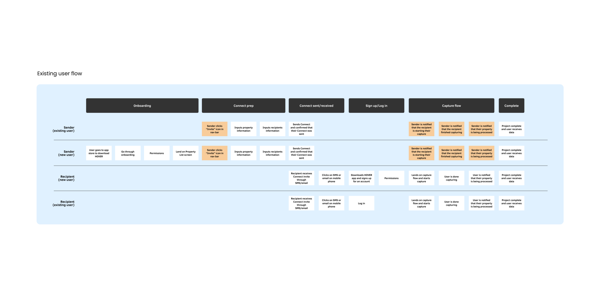
Existing flow
Sender experience
The sender opens the app and land on the home screen
Click “+ Capture”
Enter the property information
Click “Invite to Capture”
Enter recipient information
Click “Send Invitation”
Recipient experience
The recipient receives invite via SMS/email
Clicks on the link in the SMS/email
Brought to the app store to download the HOVER app
Onboards onto the app
Selects if they were able to capture now or later
Goes through the capture flow
Workshop
I co-led an all-day workshop consisting of 35 people. We held activities and group discussions with the goal to understand our users flow prior to, during, and after using the app.
Workshop learnings
There was a high onboarding success rate (from receiving the invitation to landing on the home screen).
Users felt the urgency to take the photos but not be able to right away so they ask another person to do it for them, leading to disconnects.
Most users do not know what “Connect” is without context and explanation.
The way to start a Connect was tucked inside another button so it was hard to find.
When users receive their Connect invite, they had no idea what HOVER was so they would refuse to do the capture and call their contractor to do it for them.
Contractors weren’t utilizing Connect as much because they prefer the face-to-face approach in talking to their customers.
Solutions
Solution #1
New messaging in SMS/email sent to users
Problem #1: The original message was not clear about the purpose of the email and whom it was from.
Solution: The new email and SMS message acknowledges the user and their needs and informs them on what they should do next.
Solution #2
New Connect landing screen informing users
Problem #1: Users were clicking onto the link in the email/SMS and it may be attached to a different email account (or misspelled by sender). When the user creates an account, they might be using the “wrong” email associated with the Connect even if their email address is correct.
Problem #2: Users were capturing the wrong home.
Solution: This Connect landing screen welcomes the user and informs them of what email is associated with the account and includes the address of the home to capture.
Solution #3
Mobile to web reroute
Problem: Users who open the Connect link on their desktop and create an account will not be redirected to download the app on their phone. Then they would not be able to capture their property.
Solution: When the user clicks on the link on the web, they will land on the screen on the web that redirects them to download the app on their phone.
Solution #4
Banner Connect shortcut (sender experience)
Problem: Most users are unsure of how to send a Connect through the app. The sending experience Is tucked into the Capture experience and most users didn’t think to go there to find it.
Solution: We did a quick 2-week experiment to showcase a Connect banner that will bring users through the Connect experience.
Impact
Increased Connect usage by 8% (so far!)
Project learnings
There are a lot of restrictions and roadblocks in terms of backend coding and how users are structured in the organization.
If we had time, it would be nice to tackle backend architecture first so that we can reorganize users in our database.
Insurance companies did not allow us to talk to their users because they felt it broke their privacy agreement with their customers.
The Ripples workshop was rewarding but long. The next one will be a half-day workshop with about 10 people maximum.
What would I do differently?
User an invitation code for users to link to their Connect job
An option to skip onboarding, in the beginning, to encourage capture and onboard after they’re done
Senders can customize their SMS/email message that is sent to the recipient to make it more personal and include branding


