HOVER
Blueprint Design System
Overview
I was brought on as a Design Systems Designer to work alongside a Senior Software Engineer to build HOVER’s first Design System. I had to intake the existing components, minimize, and rebuild new components and share them across the company.
My Role
Lead Designer
Duration
Aug 2019 - Aug 2020

Problem
Designers were spending a lot of time rebuilding the same components from scratch and readjusting them slightly to their individual teams. This caused inconsistency in the product and throughout the experience between mobile, web, and specific features.
Solution
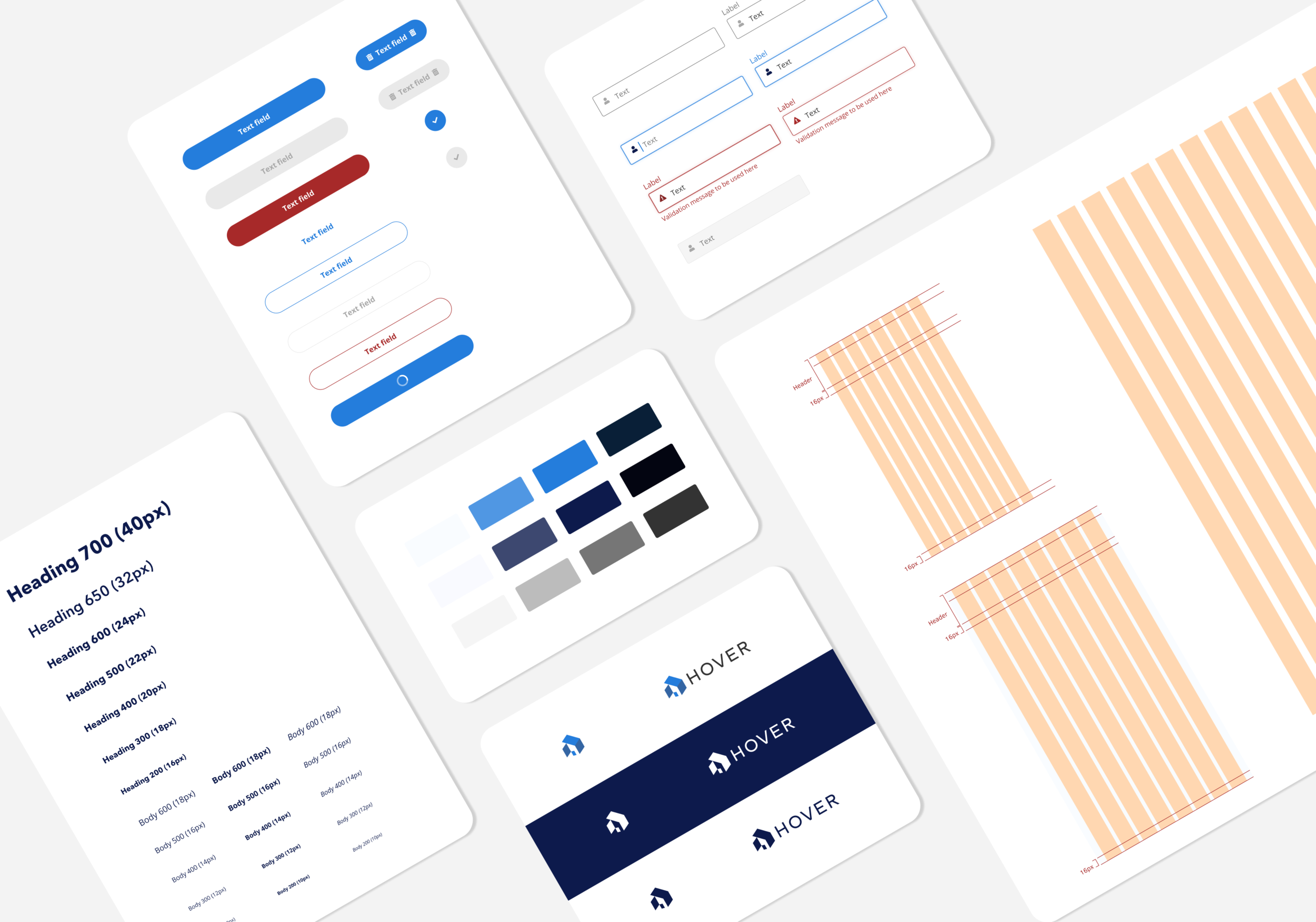
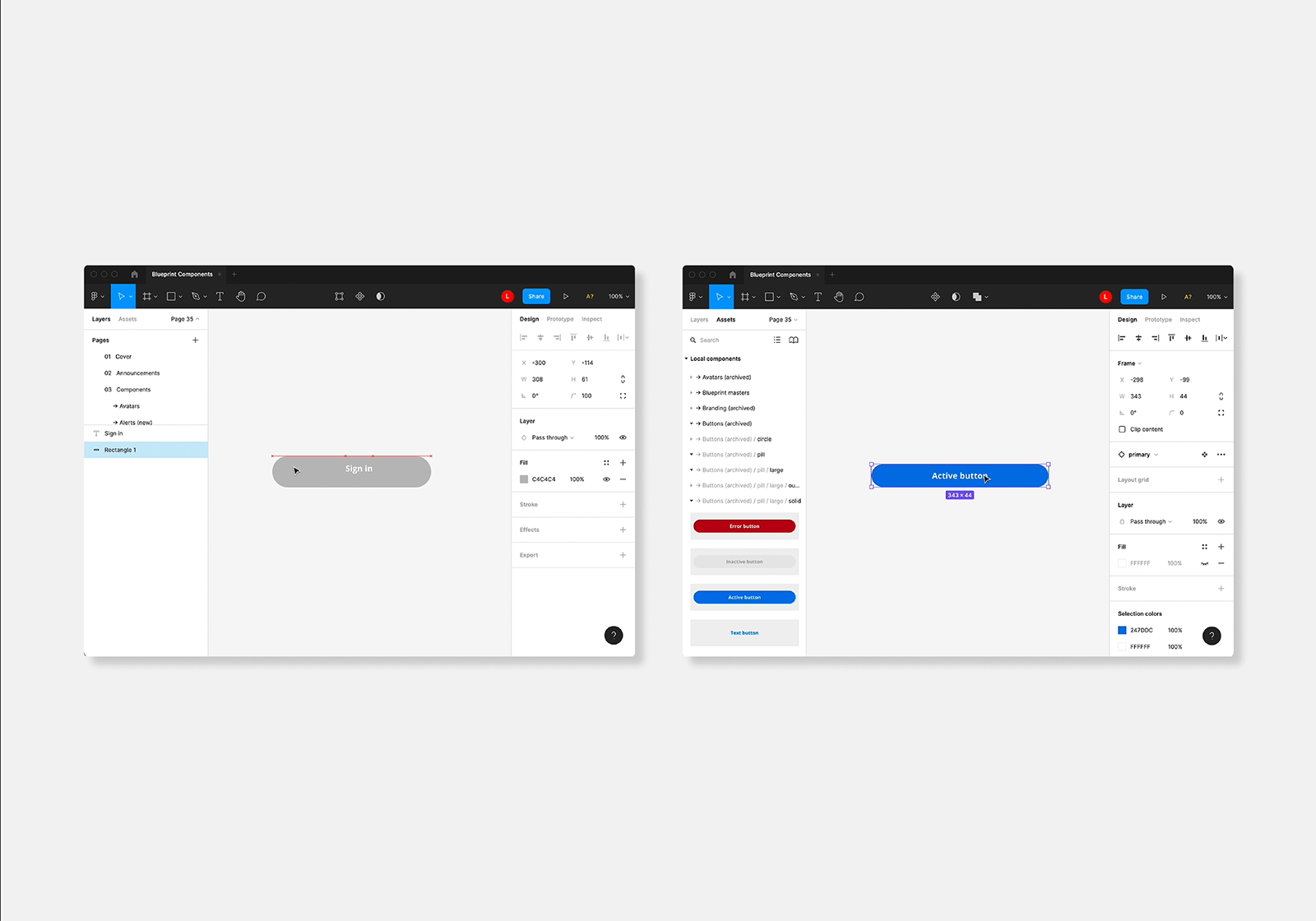
I created HOVER’s first Design System with wireframe components such as arrows, mobile screens, spacing, grids, and more. As well as, high fidelity components such as buttons, inputs, brandings, co-branding, and more. After creating new components, I created instructions so everyone (including non-designers) would know how to use them on their designs. During the process of designing components, I would be collaborating with the Senior Software Engineer on my team where he would be building the components alongside me. Finally, the designs would be announced through internal intercoms.
Goals
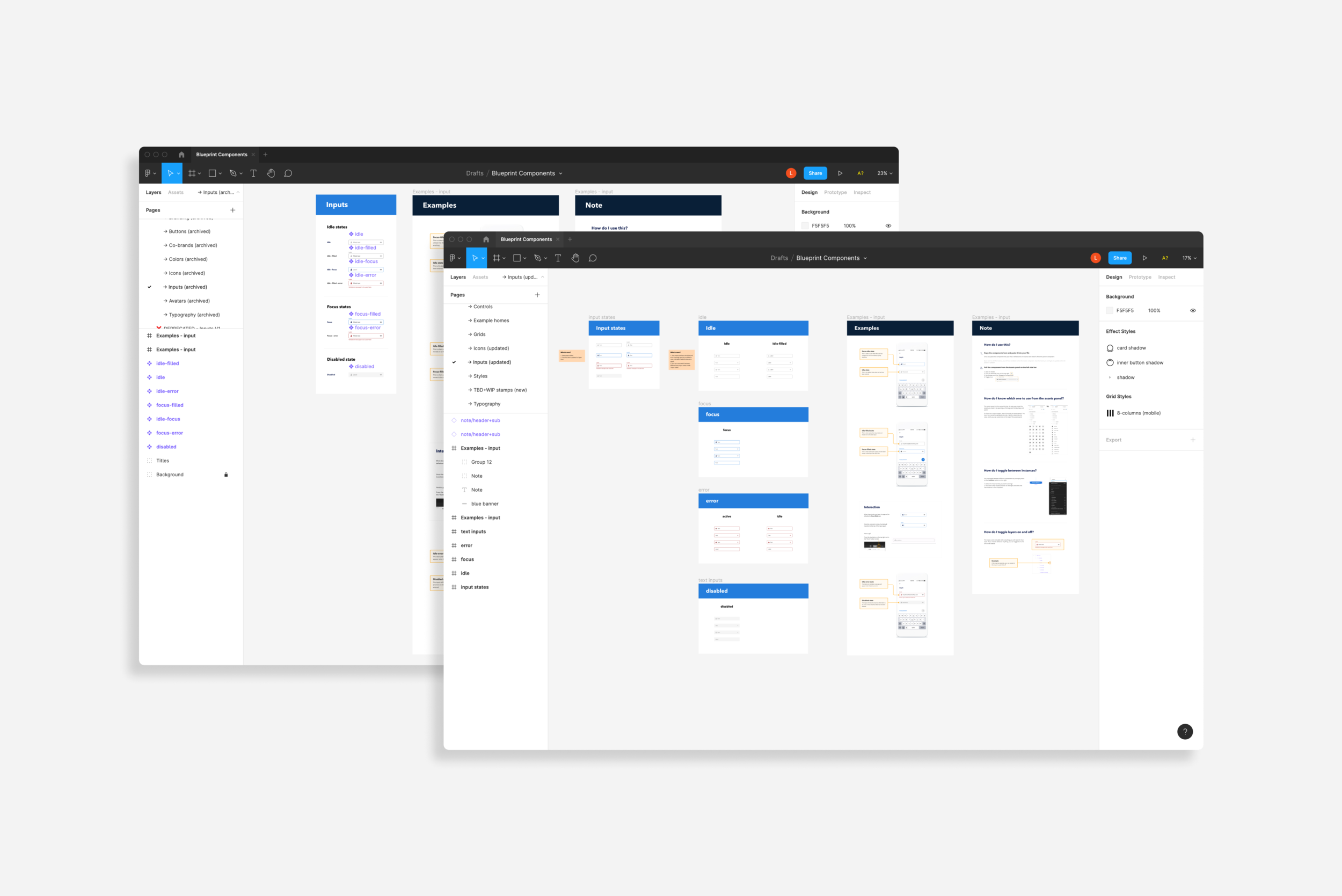
Migrate existing components from Sketch to Figma
Interview designers and engineers to learn their workflow, problems, and needs
Create a component library with styling and interaction that is cohesive to the brand
Coordinate with the Senior Engineer to build the components on Storybook
Launch and share components through Slack, Figma, and Jira

Impact
Adoption grew by 40%
Optimized design time by 3x
Engineers were able to contribute save their work time by 10x

“I was one of the first adopters of BluePrint [Design System] and was a huge influencer with all the FE teams across our company in explaining, using, and sharing why we should be using this library. As a Front End Engineer who often gets tickets to update various UI features to better fit the company brand, I loved the idea of having a single source of truth for the company's brand, designs, and components. It takes the monotonous part of my job out of the way and allows me to be more creative in other areas. I love the look and feel of our app now that we have started to unite under a similar banner and use the BluePrint Library. The best part is that they [Design System team] are open to ideas from all engineers who use it. It allows for better communication and pairing between designers and engineers. Overall, our product is much better because of this library, and it all started with the efforts of Linda and her team.”
E. Frolli, Senior Software Engineer at HOVER
Testing & Feedback
Designers were feeling limited on the components that were available and wanted to create ones on their own and didn’t know how to contribute to Blueprint
Don’t put the entire system into one Figma file it slows down the file and it will eventually max out on memory and slow the entire file down. Break everything up into their own files instead and link them all into one for visibility and searchability
Establish early on what the source of truth is - The Figma files? Or code? Always code
Project learnings
Set up a contribution plan (for both designers and engineers) earlier on to get involvement and included so they feel a sense of ownership and advocate to use the components more.
Engineers are really excited to use Blueprint after learning that the code is set up to align with the design names in Figma.
Follow this Storybook link to learn more about the Design System, Blueprint.